
Typography Secrets That Strengthen Your Brand
How typography shapes brand perception
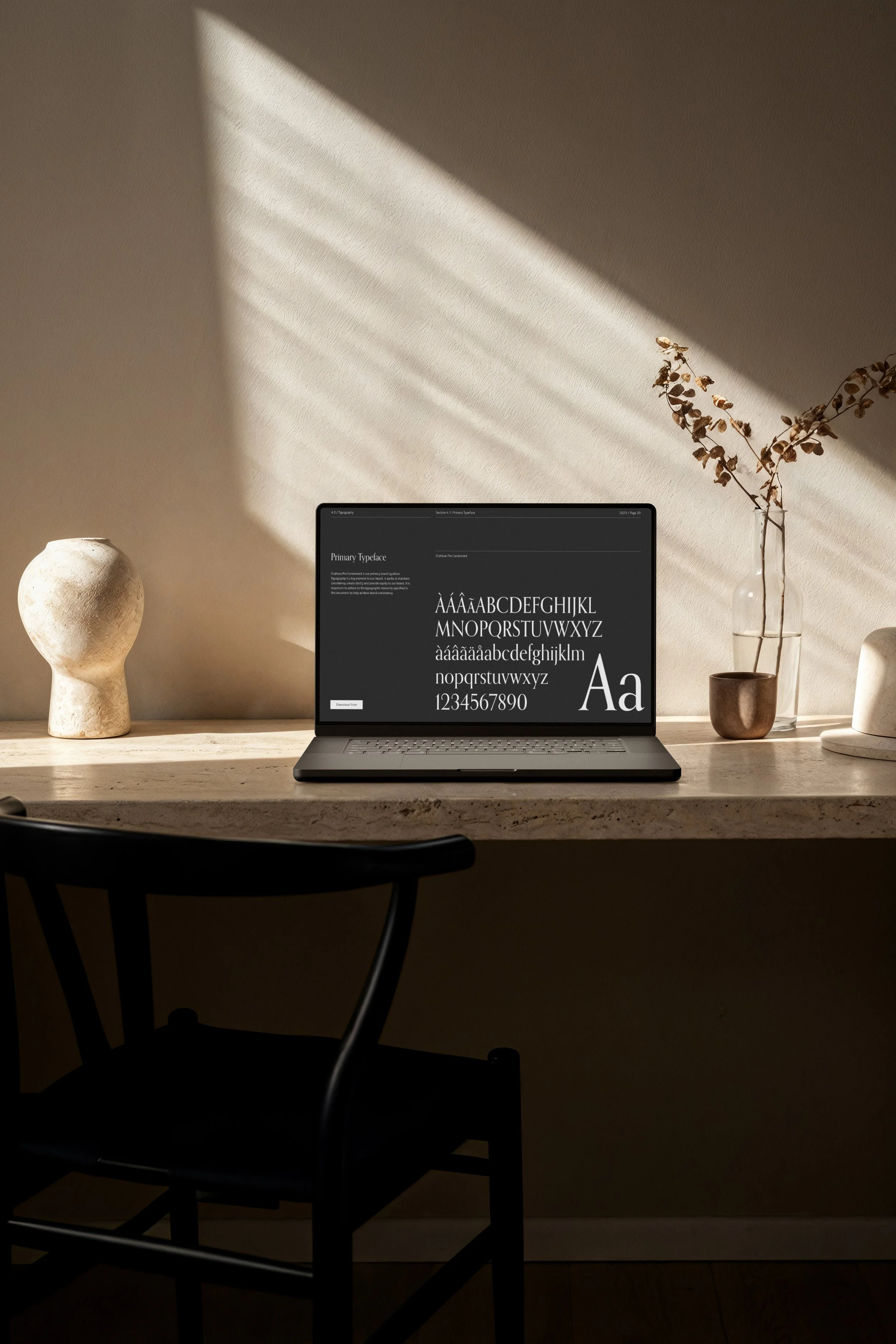
Typography is more than choosing a pretty font. It is a powerful tool that communicates your brand’s personality, values and credibility. Every letter and line tells your audience something about who you are. When used well, typography makes your brand cohesive, professional and memorable.
Typography sets the tone for how people see your brand.
Serif fonts feel traditional, reliable and refined.
Sans-serif fonts look modern, clean and friendly.
Script fonts show elegance and creativity.
Bold display fonts suggest confidence and authority.
Font choices, hierarchy and consistency build trust and recognition. When typography reflects your brand values, people understand your message instantly. Poor font choices can make even a strong brand appear unprofessional or unclear.
Typography may seem subtle, but it shapes how clients judge your professionalism, style, and suitability for their needs. This article explores how thoughtful typography can elevate your brand and help it stand out.
1. Typography communicates personality
Every font carries emotion. Serif fonts feel classic and dependable. Sans serif fonts feel modern and approachable. Script fonts suggest elegance. Bold display fonts signal confidence.
The right font connects your visual identity with your brand voice. When typography aligns with your message, clients instantly know who you are and what you represent.
2. Consistency builds recognition
Consistent typography across all platforms creates unity. Use the same fonts on your website, social media, proposals, and marketing materials. This helps your audience recognise your brand instantly.
A clear hierarchy (headings, subheadings, body text and accents) guides readers and reinforces professionalism.
3. Legibility and accessibility matter
Style means little if people cannot read your text. Choose fonts that are clear on all devices and screen sizes.
Accessible typography shows respect for all users. Readable fonts make your brand more inclusive and trustworthy.
4. Pair fonts with purpose
Effective font pairings add depth and interest. A bold display font for titles and a simple font for body text is a reliable approach.
Keep it balanced. Too many fonts create clutter. Thoughtful pairings strengthen your message and enhance visual appeal.
Why work with a professional design studio
1) Expertise in typeface selection
A professional designer understands the nuances of typography. They know how different typefaces communicate tone and personality. This expertise allows them to choose fonts that enhance your unique style and strengthen your brand identity.
2) Custom typography for a distinct brand
Sometimes a brand needs more than an off-the-shelf font. Designers can create or refine typefaces that capture your signature style. Custom typography gives your brand a unique look that stands out and feels authentic.
3) Consistency across every platform
Typography is a key part of a cohesive brand identity. It appears on your website, stationery, and social media. A professional studio ensures your fonts stay consistent across all materials, reinforcing trust and recognition.
Working with a studio ensures your typography feels intentional and aligned with your brand strategy. This investment builds recognition, trust, and long-term value.
Final Note
Typography is one of the most powerful yet overlooked tools in branding. The fonts you choose do more than display words. They communicate your values, personality, and professionalism.
Thoughtful typography elevates your brand. It builds trust, shapes perception, and helps you stand out in a crowded market.
Ready to strengthen your brand? We offer a range of services, including help with font selection.