Sophie Bates Architects
Sophie Bates Architects is a boutique architectural practice specialising in high-end residential projects. Sophie’s approach blends creativity, technical expertise, and thoughtful design to deliver homes that are both functional and inspiring. The studio designs every project with precision and individuality, creating bespoke new builds, extensions, and renovations that capture each client’s unique vision and way of life.
-
The Challenge
Before collaborating with Studio Sulis, Sophie struggled to communicate the essence of her boutique practice with clarity and impact. Her existing materials and onboarding processes didn’t fully express her thoughtful, client-first philosophy, making it harder to stand out and build trust from the outset. She needed a cohesive, modern messaging system that clearly articulated her values, adapted to projects ranging from £250k extensions to £1.5 million new builds, and established an immediate sense of confidence and connection with every potential client.
The Solution
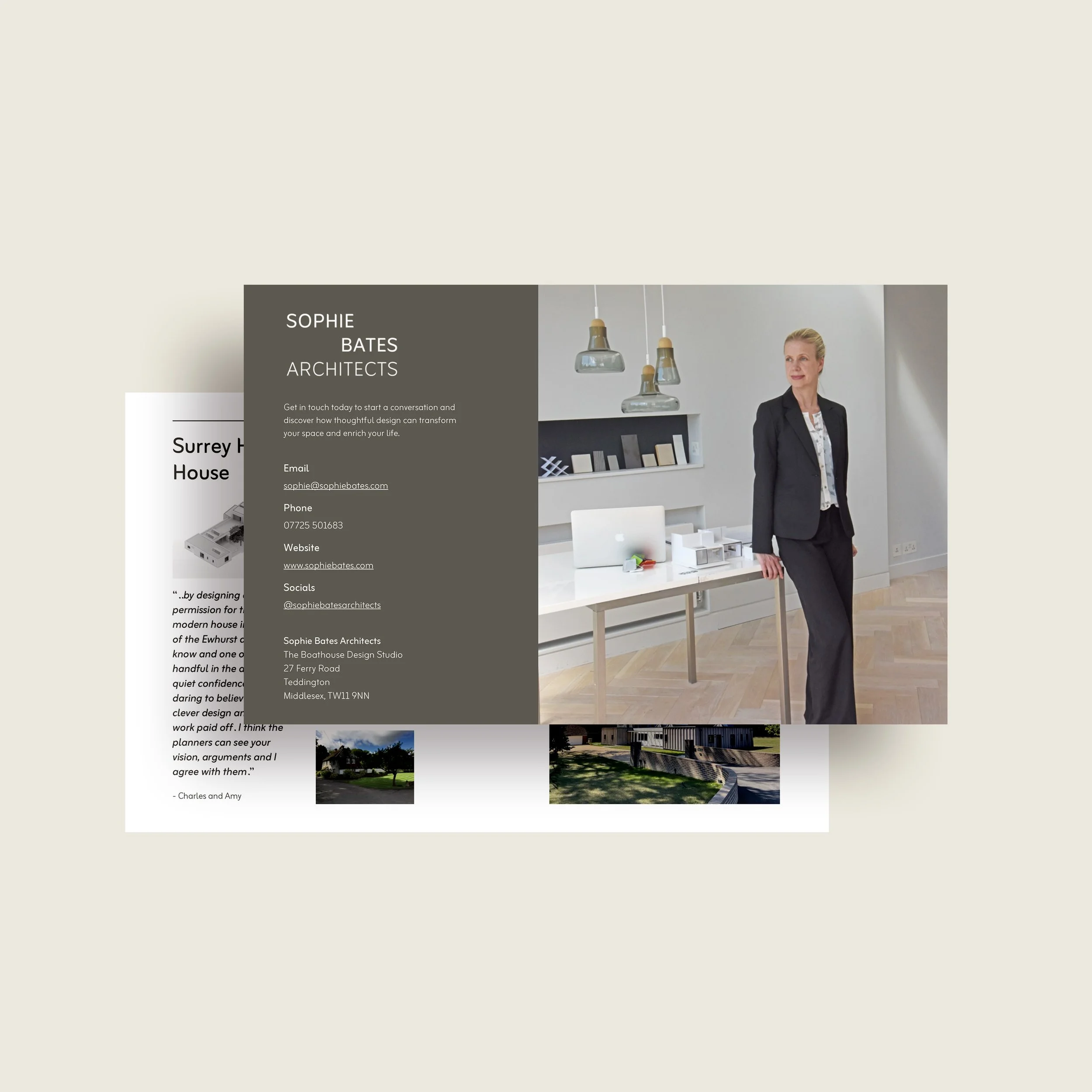
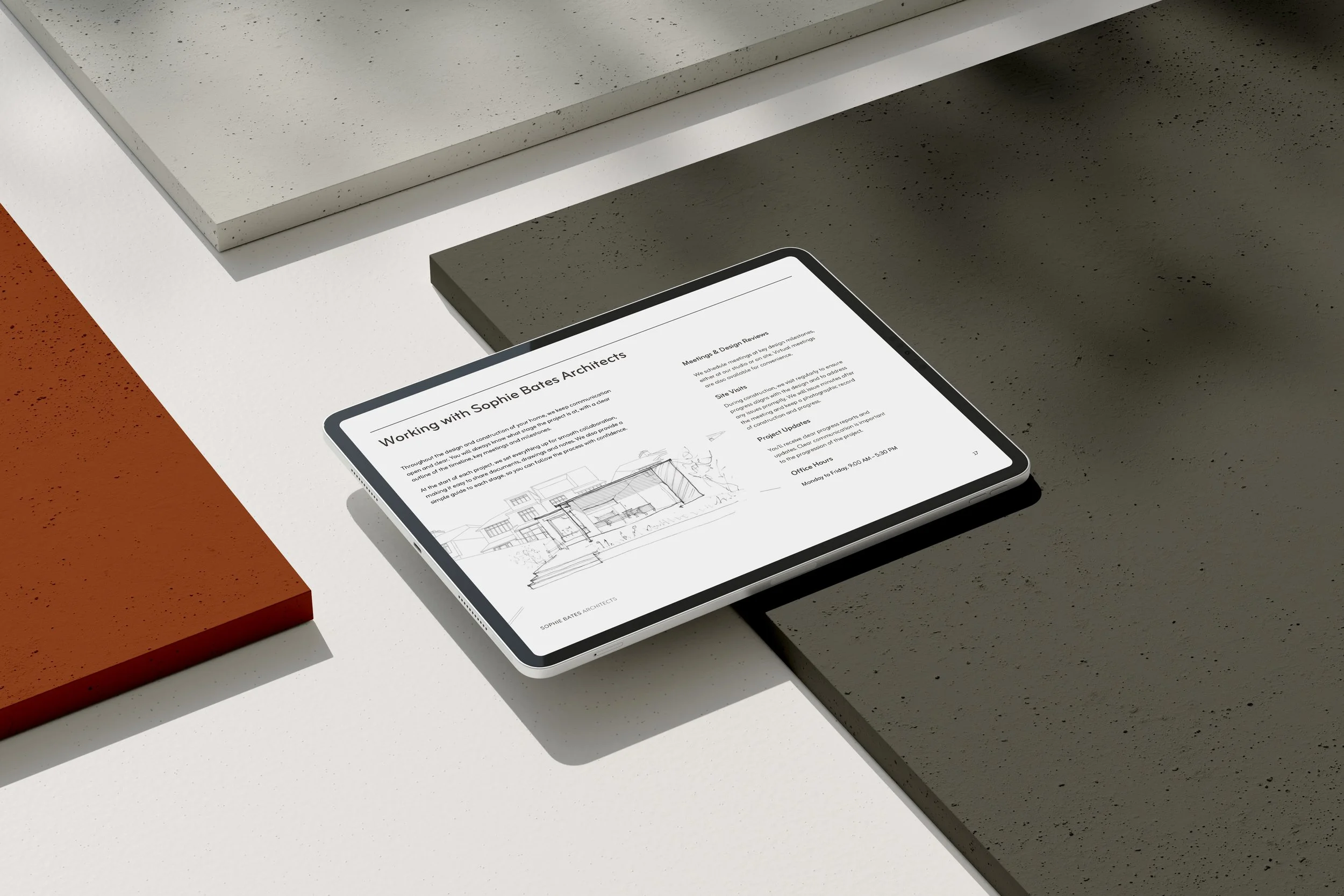
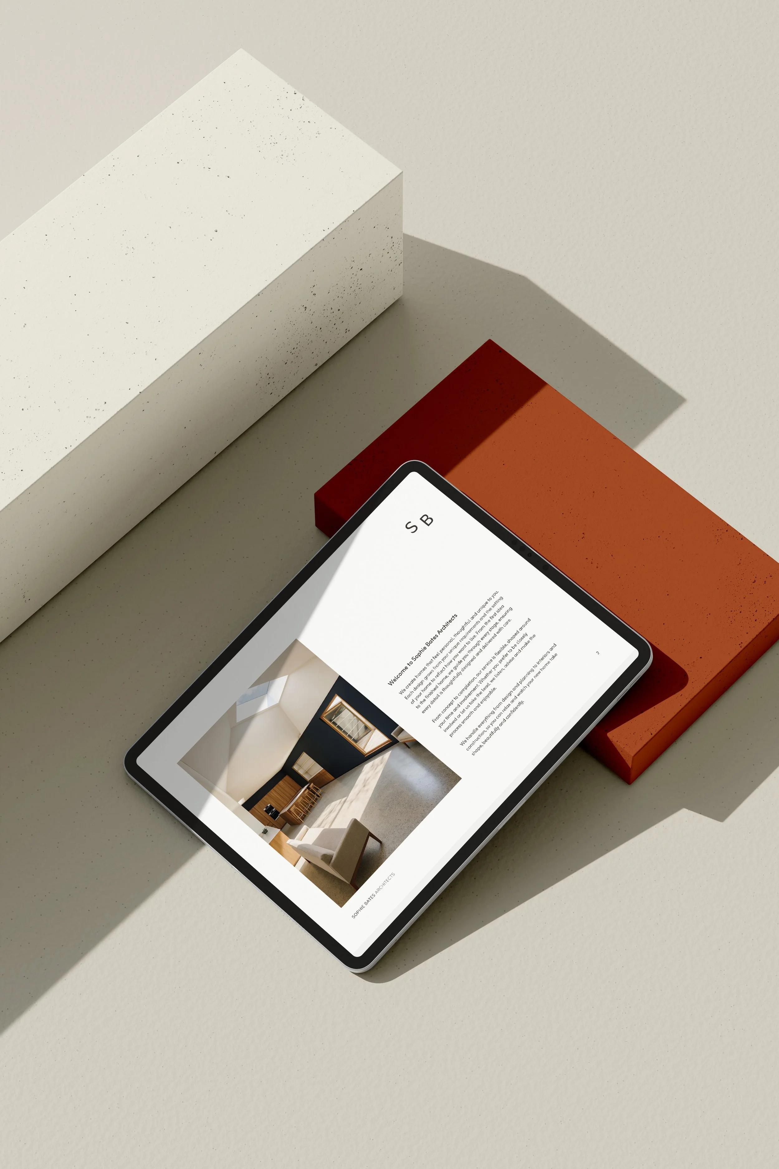
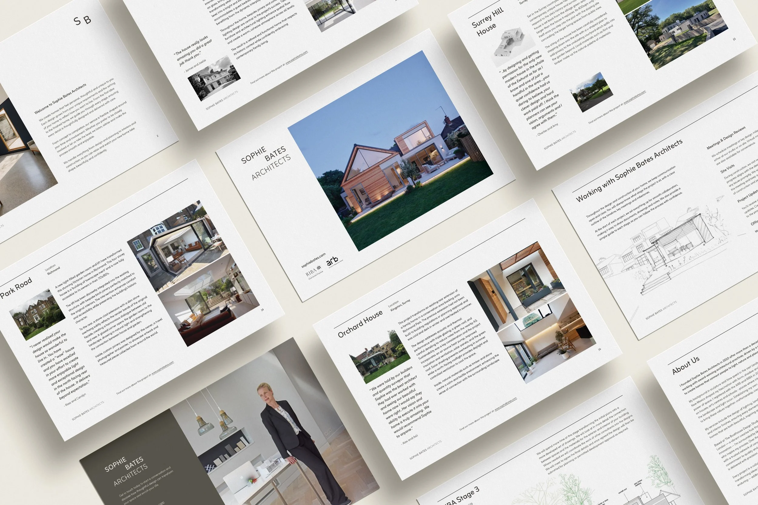
We began with our BrandLite package, establishing an initial framework to clarify Sophie’s brand positioning. This developed into a mini-strategy and visual identity, including a logo suite, typography, colour palette and comprehensive brand guidelines.
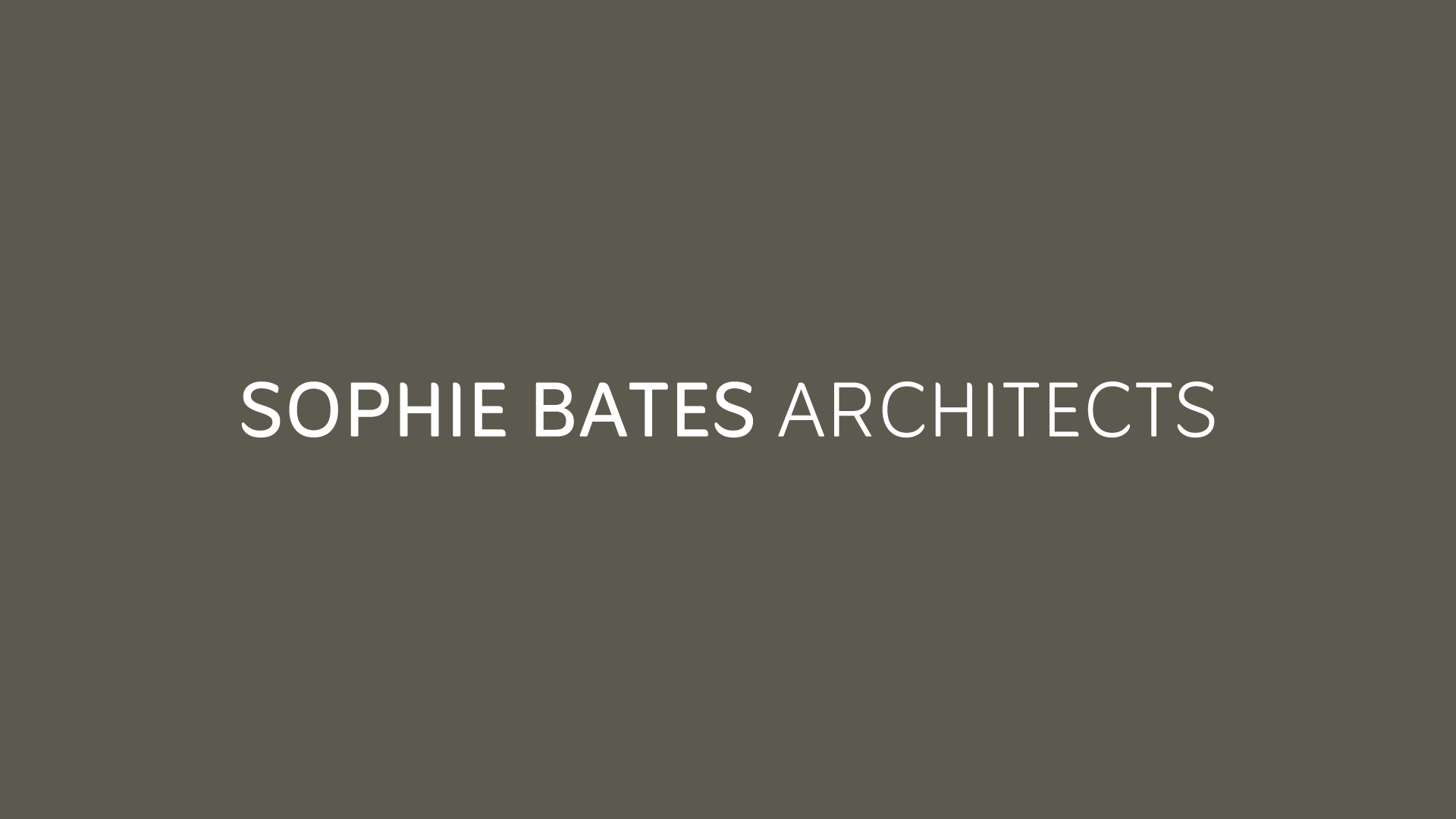
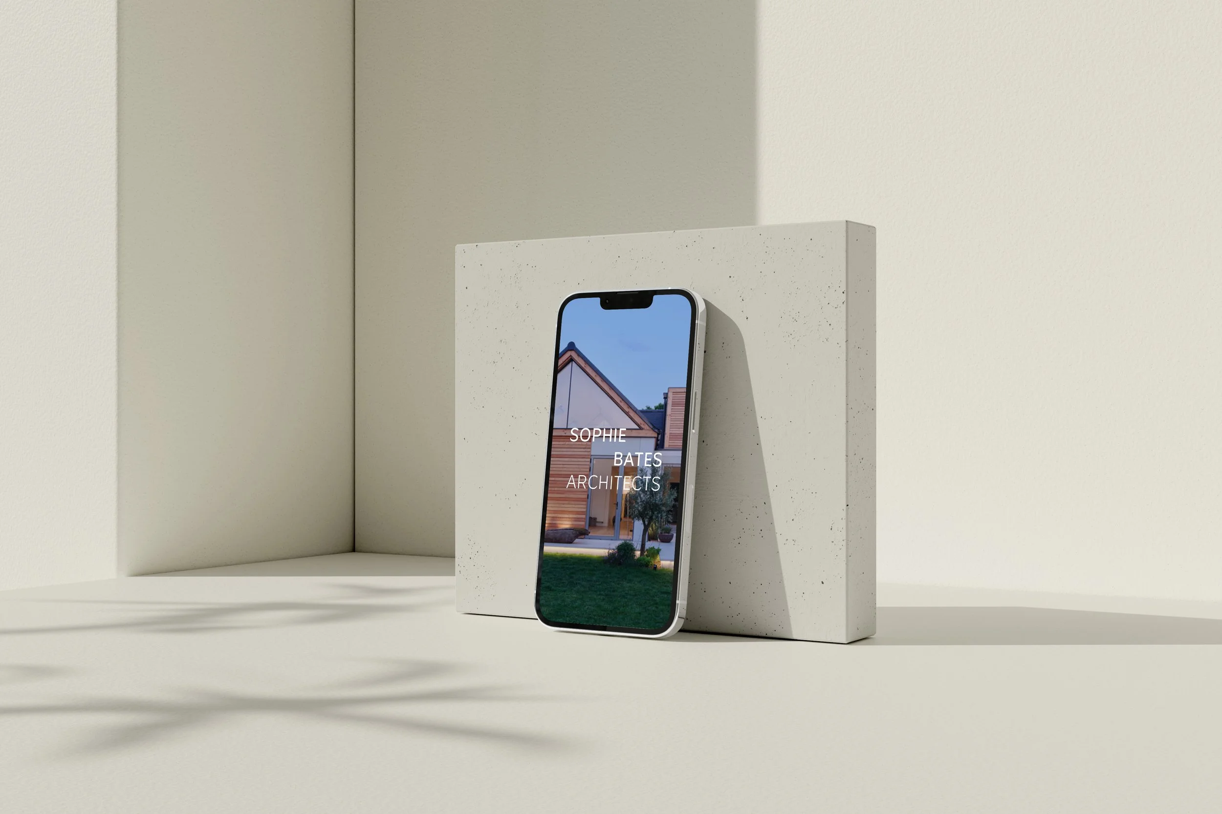
The logo suite was designed to be sophisticated and versatile, reflecting the premium, bespoke nature of Sophie’s work. The primary logo breaks the name into three lines, placing emphasis on “Sophie” and “Bates,” reinforcing the boutique, personal identity of the practice. Its simplicity and clarity ensure strong recognition, while secondary logos provide flexible, contemporary options that maintain the brand’s timeless and high-end character.
Typography plays a central role in communicating the brand’s values. An all-caps sans-serif typeface conveys confidence and clarity, with presence without heaviness. Rounded edges introduce subtle softness, balancing the firmness of all-caps and avoiding the aggressiveness of condensed or angular fonts. Generous letter-spacing (tracking) creates a sense of calm and sophistication, while the clean, minimal geometry aligns with the precision, discipline, and innovation inherent to architectural craftsmanship.
The colour palette combines refined neutral tones with subtle accent colours. This balance of warmth and elegance creates a cohesive, timeless identity that feels both premium and approachable.
The Outcome
The refreshed brand gives Sophie clarity and confidence in every client interaction. The brand strategy refined her messaging, ensuring her proposals, presentations, and digital content communicate her thoughtful approach and attention to detail with consistency and purpose. Combined with a cohesive visual identity, Sophie Bates Architects is positioned as a premium, trusted practice, attracting the right clients and enabling clear, focused content across the website, social media, and all client touchpoints.
Sector
Architecture
Branding Package
BrandLite
Brand Signature
Project Scope
Mini Brand Strategy
Logo Suite
Font Selection
Colour Palette
Brand Guidelines
Welcome Brochure