Zoe Claymore Garden Design
Zoe Claymore is an award-winning garden and landscape designer based in Richmond upon Thames, Greater London. She specialises in small to medium-sized residential gardens across London and Surrey. Zoe’s work combines her passion for spatial design, plants and the transformative power of nature to create outdoor spaces that enhance daily life.
Following a successful summer of RHS shows, Zoe was experiencing rapid growth and attracting clients with diverse budgets and expectations. She wanted a brand that would elevate her services, communicate her expertise, and reflect who she is as a designer. Studio Sulis collaborated with Zoe to create a cohesive strategy, visual identity and brand stationery that positioned her as a trusted, premium designer while keeping her personality and warmth at the heart of the brand.
-
The Challenge
Although Zoe had achieved recognition and awards early in her business, she faced challenges common to designers. Her client base was varied and she wanted to attract the right type of client who valued her premium service. She needed a brand that clearly communicated her expertise, approach and the emotional impact of her work, while giving her confidence in client onboarding, proposals and presentations. Zoe’s goal was to create a brand that felt both professional and personal, elevating her business while remaining authentic to her creative style.
The Solution
We began with our BrandLite package, which laid the foundation for the rest of the process. This then evolved into our Brand Signature package, allowing for a full strategic and visual identity refresh.
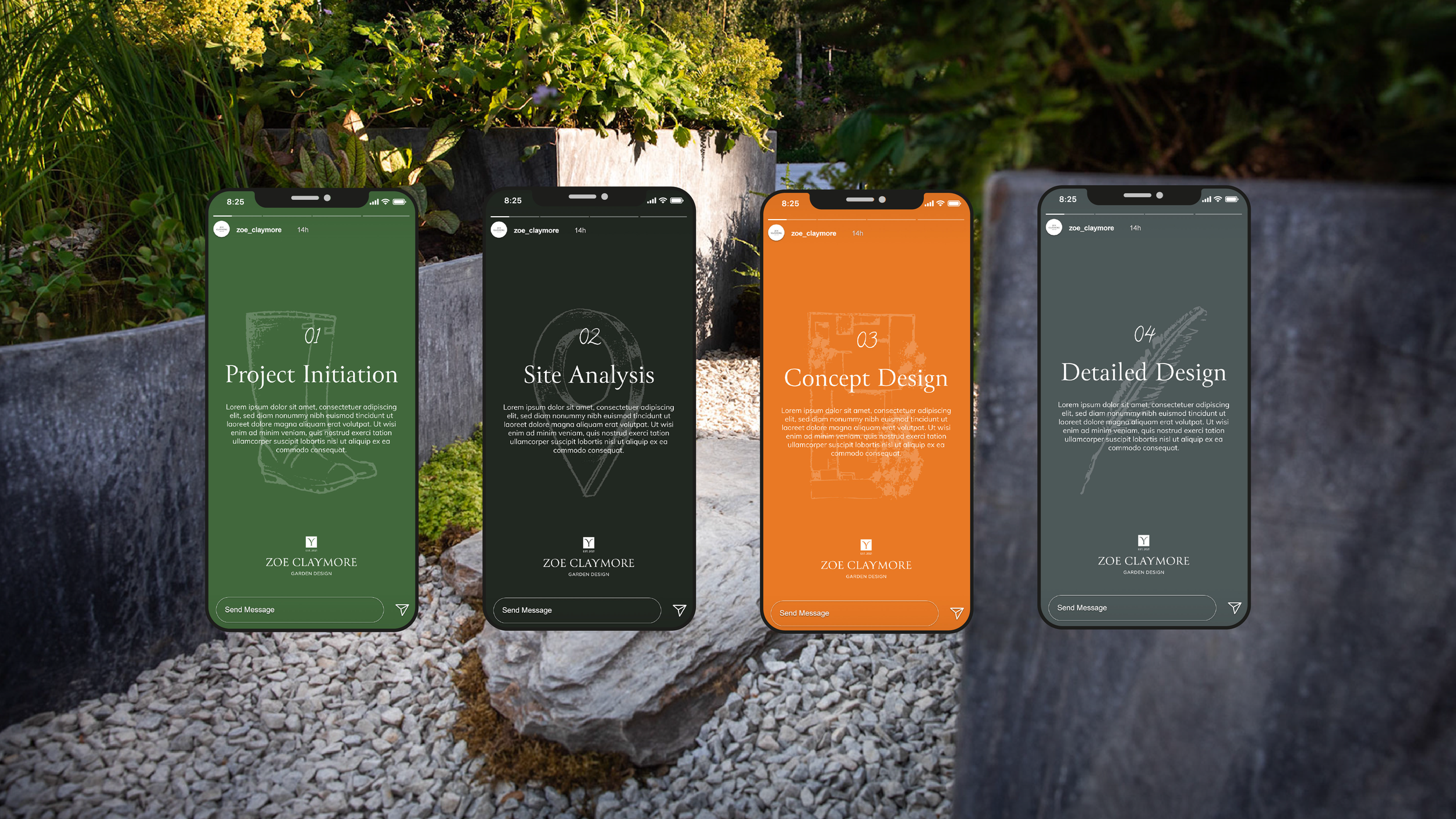
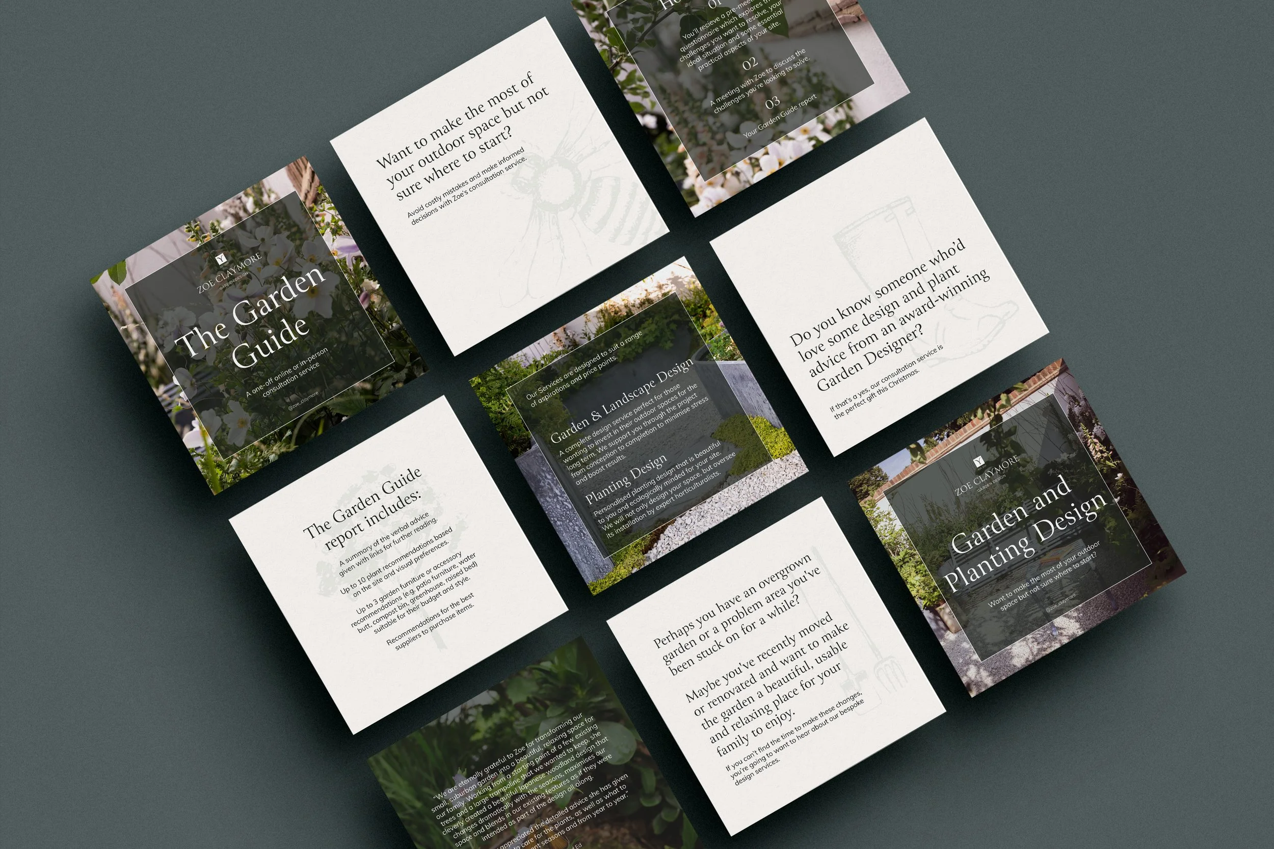
The visual identity reflects Zoe’s warmth, creativity and love of nature. We developed a vibrant orange and green colour palette to reflect her energetic and approachable style, supported by softer tones of grey, light grey and cream.
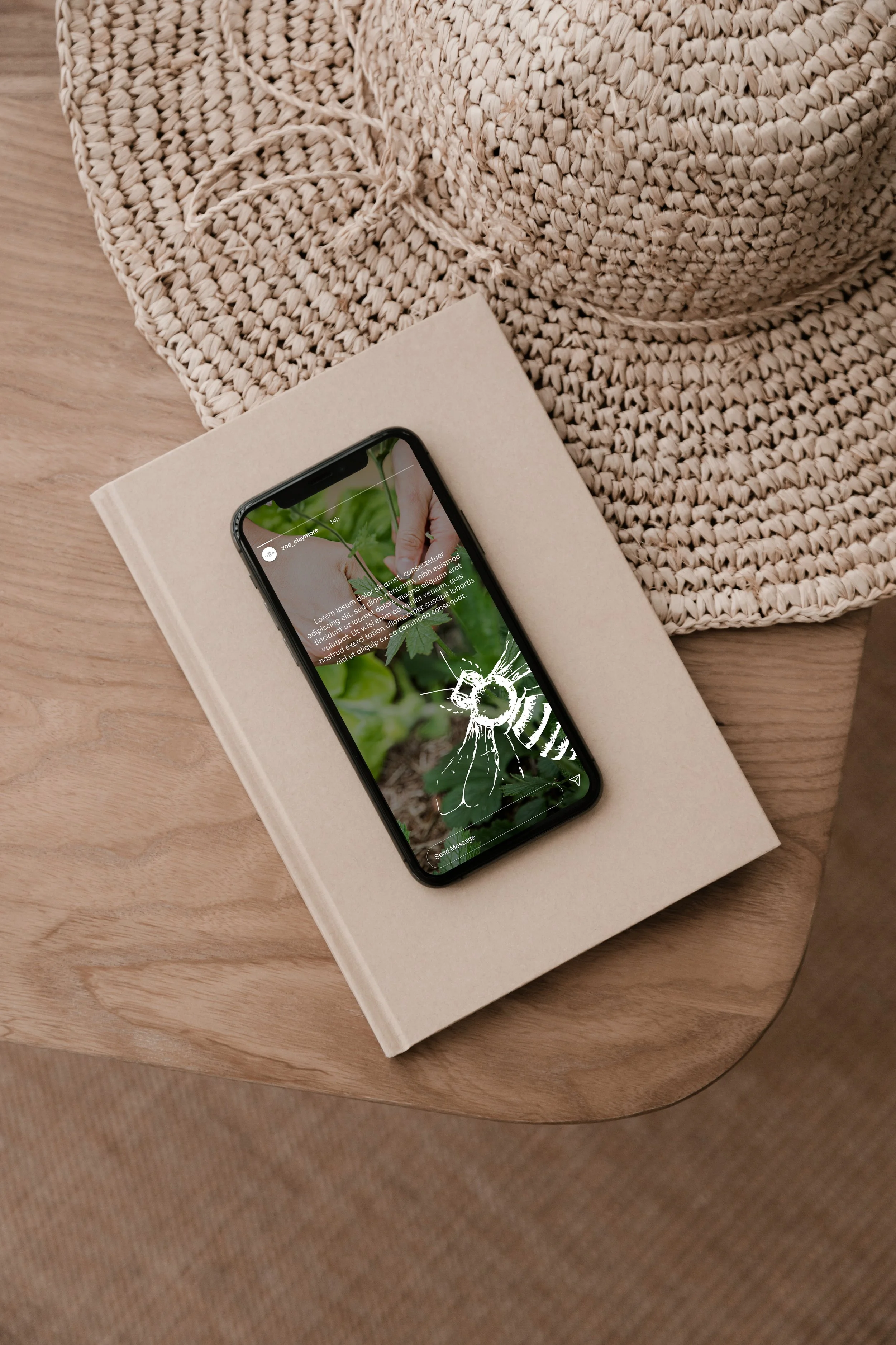
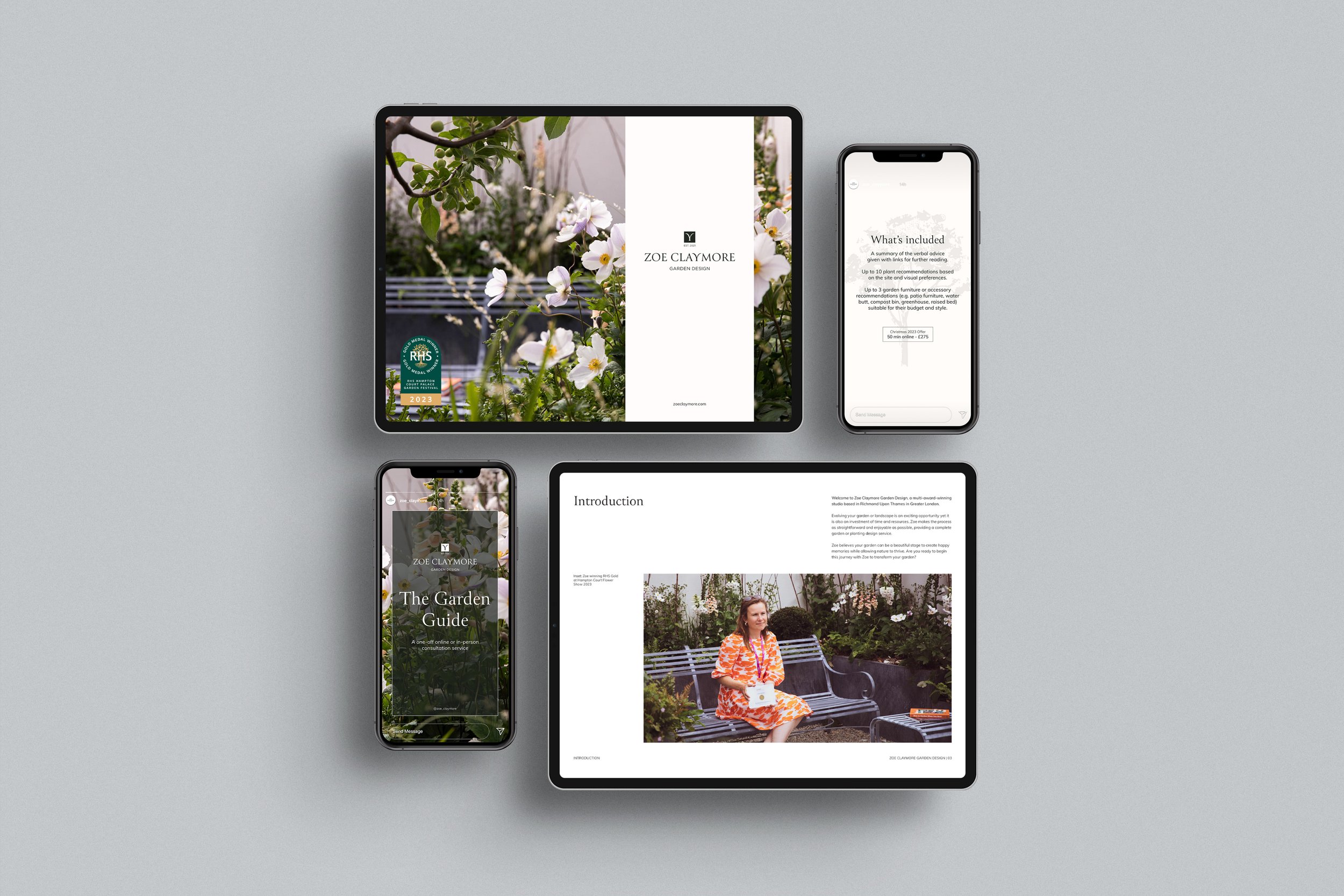
The logotype uses a Roman-style typeface characterised by vertical strokes, conveying structure while its fluidity evokes the organic shapes and textures of plants. A distinctive brand mark was derived from the “Y” in ther logotype, inspired by growth and sustainability. This element can be used as an icon or decorative feature across social media and brand materials, reinforcing the connection to nature.
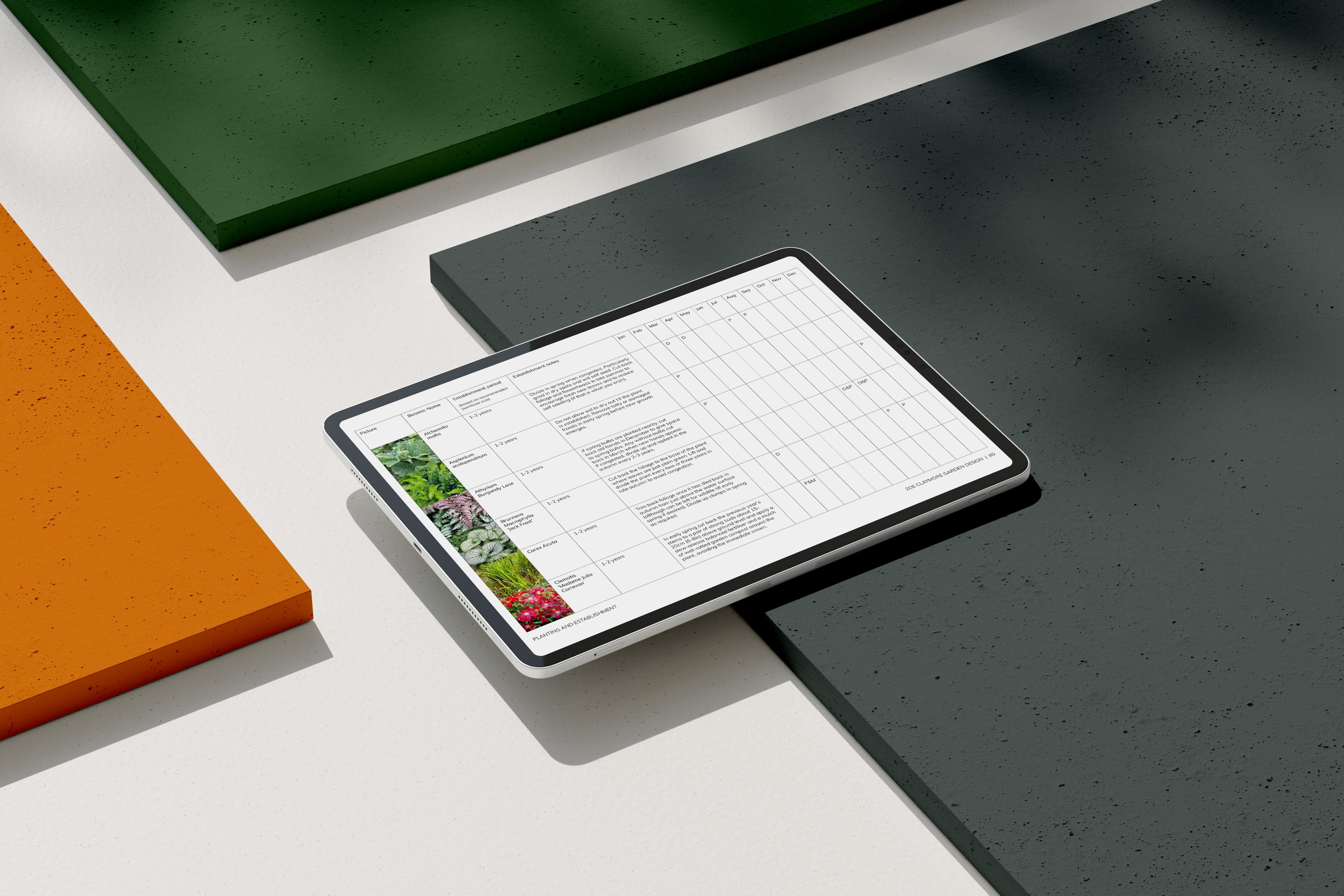
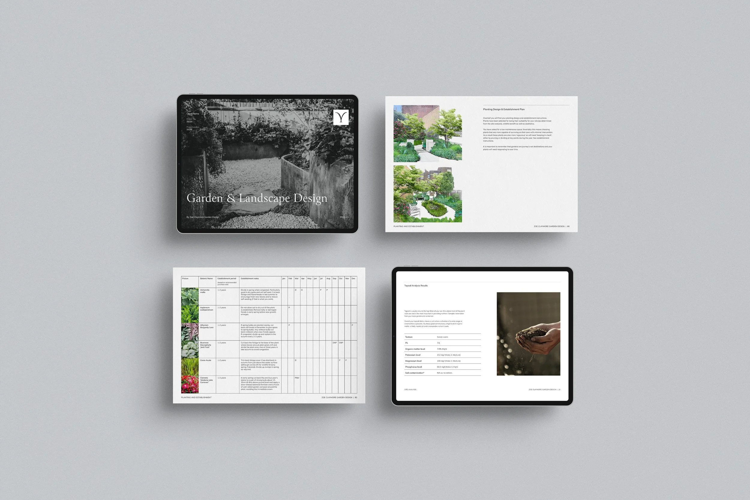
Supporting graphics, including hand-drawn icons add personality, playfulness and a rustic, organic feel to the brand. Alongside the visual identity, we developed branded stationery, flyers, magazine adverts, a welcome brochure, invoice and estimate templates and a suite of social media templates, ensuring consistency across all touchpoints.
The Outcome
The refreshed brand gives Zoe confidence in her messaging, proposals and client interactions. It communicates her premium expertise while reflecting her fun, approachable personality. The cohesive visual identity ensures recognisability across all materials and platforms, helping Zoe attract the right clients who value her creativity, knowledge and attention to detail.
Sector
Garden Design
Branding Package
BrandLite
Brand Signature
Project Scope
Logo Suite
Colour Palette
Font Selection
Iconography
Brand Guidelines
Welcome Brochure
Branded Templates
Social Media Templates
Leaflet & Magazine Advert
Photography
Annabelle May